CASE STUDY — BRAND IDENTITY
St. Michael’s Design Studio
A full identity system for a bespoke liturgical vestment atelier. It includes a sword-and-cross monogram, a stationery suite, and a brand illustration set, all designed to hold up on fabric, foil, and paper.
THE BRIEF
An identity with the weight of something inherited.
St. Michael’s Design Studio hand-tailors chasubles, copes, and stoles for parishes and religious communities. These are garments meant to last decades, not seasons. The studio wanted an identity built to the same standard: elegant, luxurious, and rooted in a sense of heritage. It needed to work everywhere, on a business card, a website, or a piece of embroidery.
The creative direction came from the studio’s namesake. St. Michael the Archangel, and the line “defend us in battle” from his prayer, became the starting point for the mark. One requirement mattered above all: the design had to work cleanly in print, on screen, and in thread.
MARK & MONOGRAM
“Defend us in battle,” cast as a monogram.
The mark is built from two references: the studio’s namesake archangel, and the line from his prayer that the brief was built around. St. Michael’s wanted something that felt inherited rather than designed: one shape that reads as old and expensive whether it’s foil-stamped, screen-rendered, or stitched.

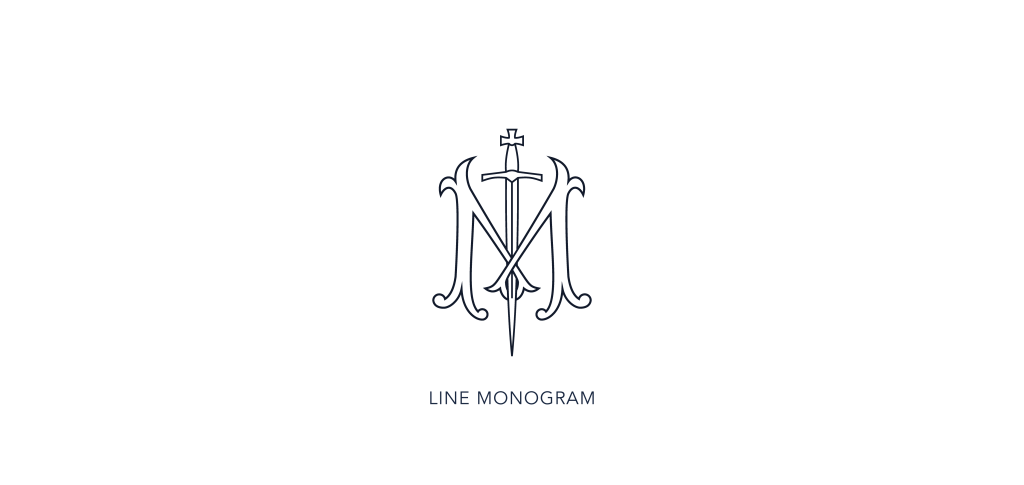
01. Ligature
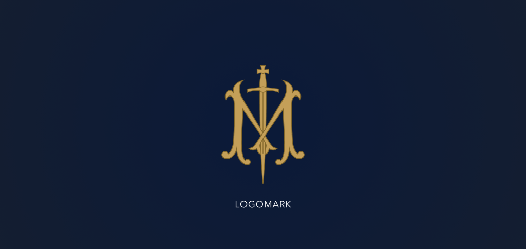
Two serif Ms interlock around a shared spine, the kind of construction that reads as centuries-old rather than newly drawn. It’s the first move toward a mark meant to carry weight and heritage.
02. Blade as stroke
“Defend us in battle” is the line from the Saint Michael Prayer the studio named as the brief’s starting point. The sword takes the place of the monogram’s vertical stroke rather than sitting beside it as illustration. The reference is structural, not decorative.
03. Cross pommel
A small cross caps the hilt, simplifying the mark’s outline enough to survive three very different surfaces: foil on a card, pixels on a screen, and a single continuous line of embroidery thread.
IDENTITY SYSTEM
One mark, four registers.
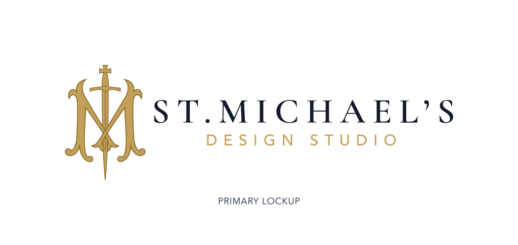
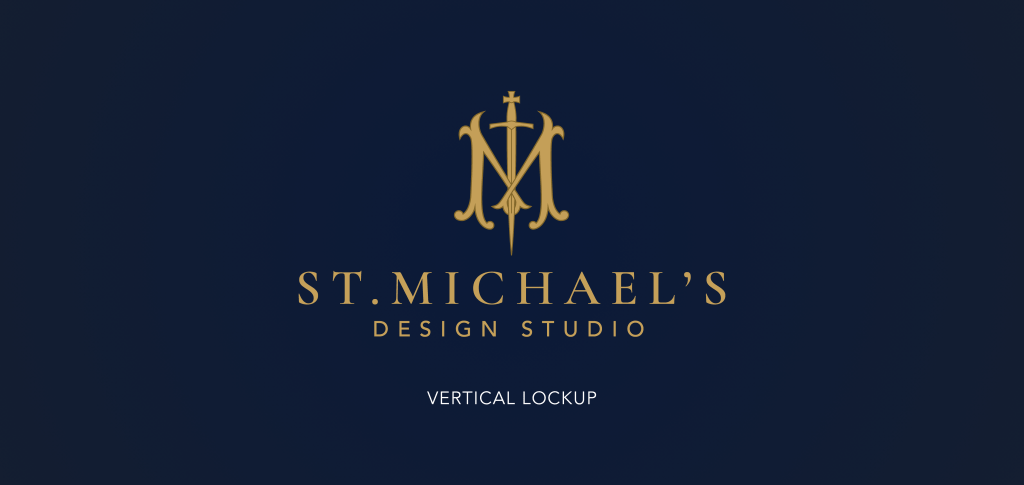
Primary lockup, vertical lockup, standalone logomark, and a line-only monogram for engraving, embroidery, and single-color reproduction.
PALETTE
Vestment gold, liturgical navy.
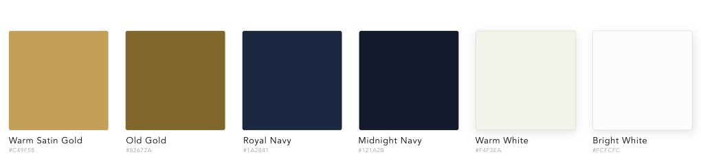
Six colors, specified like fabric swatches so they reproduce the same way everywhere, print, screen, embroidery, or paint.
STATIONERY SUITE
The mark, printed.
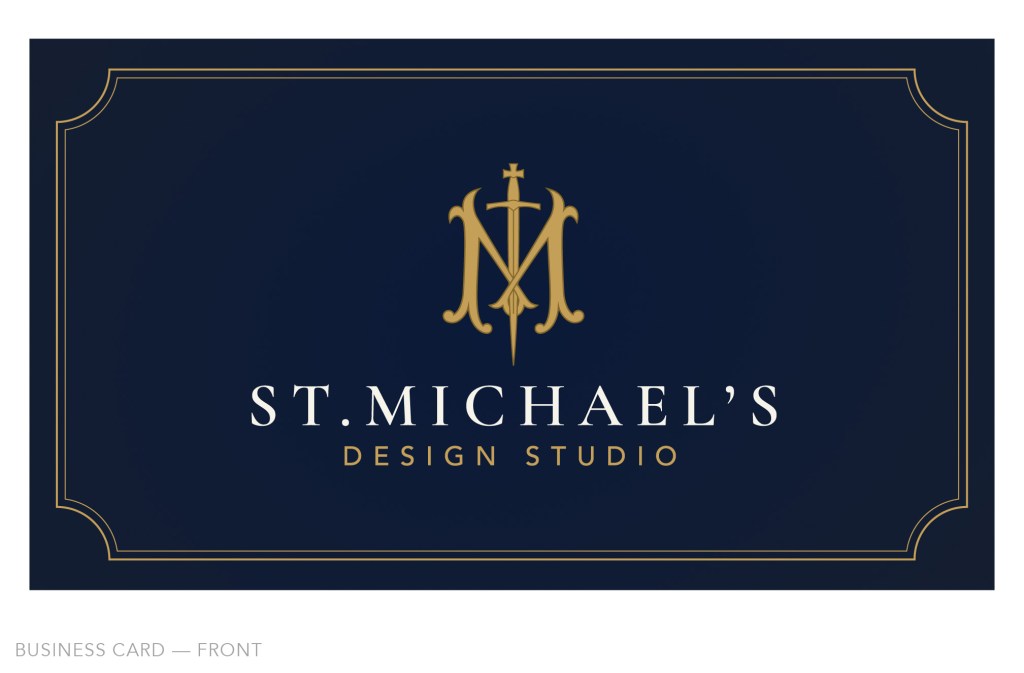
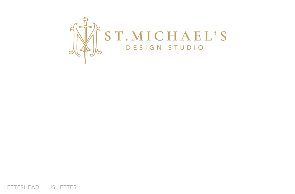
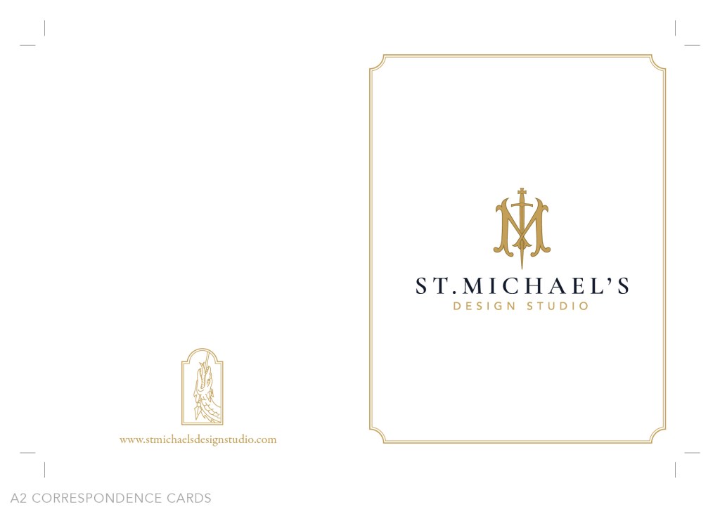
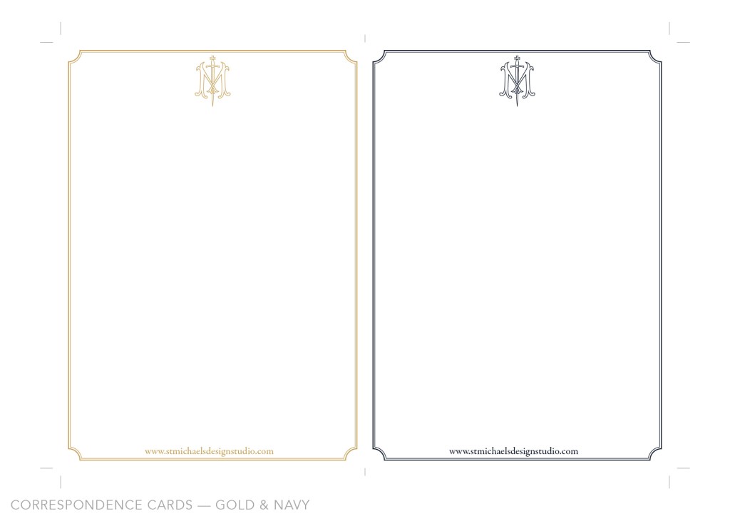
A business card, letterhead, and correspondence cards carrying the same monogram across navy, gold, and cream stock.
BRAND ILLUSTRATION
The dragon underfoot.
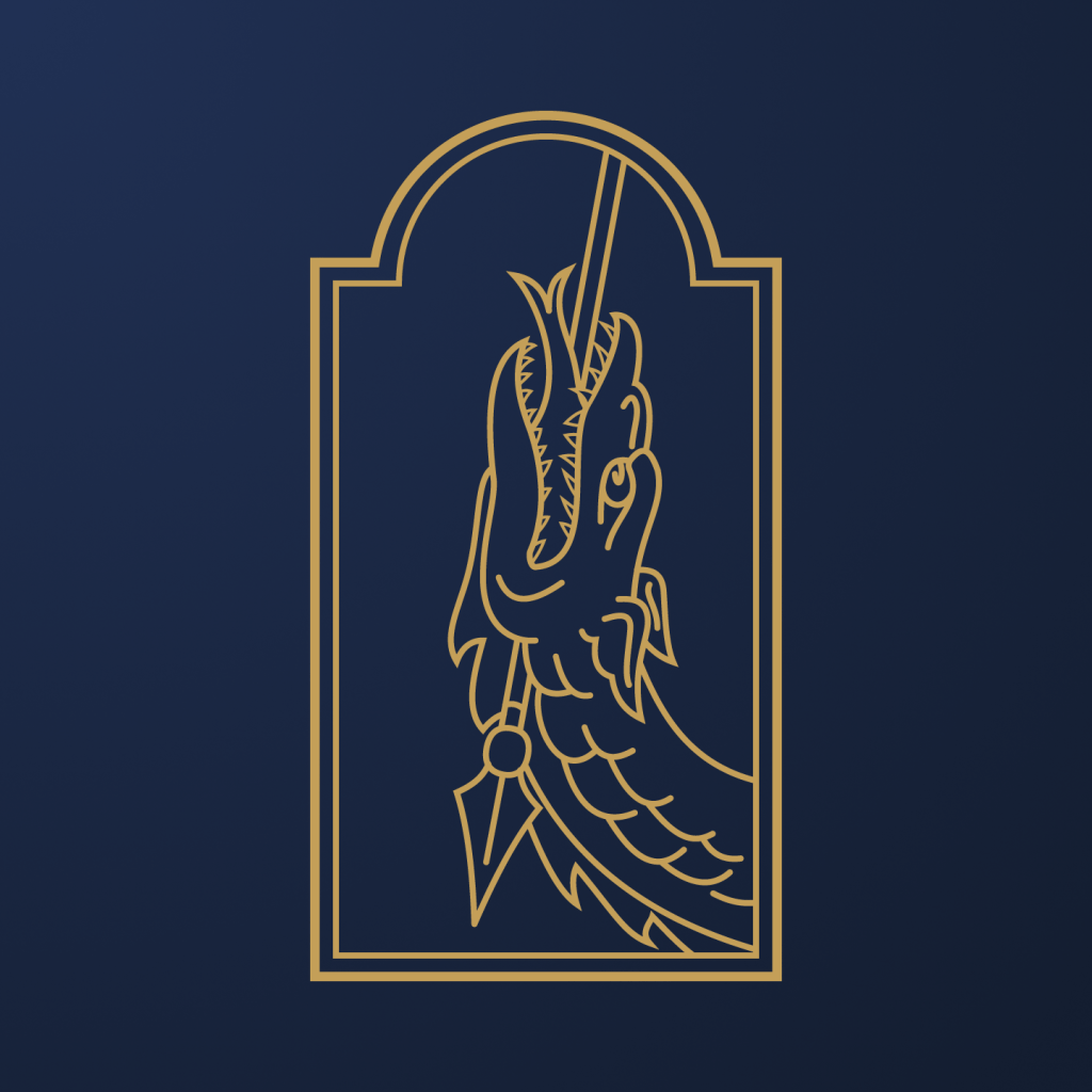
Every image of St. Michael includes the thing he’s defending against. The studio’s brand illustration is that dragon, drawn from the same prayer that shaped the mark: “defend us in battle.” It carries the same fine, engraved line as the monogram, so it reads as part of the same inherited world.
The illustration sits inside a gothic arch, so it can double as a seal, a stamp, or a woven label. It uses the same two colors as the rest of the identity, gold and navy, so it works on a hangtag, a card, or a garment without adding a third ink.

WHERE IT LIVES
The identity is live.
The full system now runs the studio’s site, stationery, and correspondence. One mark, cut for print, thread, and screen.